Artwork Colour Profiles
When you’re planning your book, it’s important to understand how colour is produced on printers and what your printer recommends for colour settings. At Copywell, we print using various equipment that all have different ways of interpreting colour from a digital print-ready file. Being based in Toronto, Canada, we work with a North American standard colour setting and print all jobs with a CMYK colourspace.
What is CMYK?
This term is used widely throughout the printing industry and is an acronym for Cyan, Magenta, Yellow, and Black. These four magical colours combine to produce hundreds of thousands of colours by laying colours on top of each other in a specific order, which is known as four-colour-process.
Check out this webpage with a lot of useful information “10 Printing Terms You Need to Know”
Should I Print With CMYK or RGB?
A common question we find with first time authors is whether they should use RGB or CMYK when designing their book artwork to print. We recommend always using CMYK for anything that is to be printed. All of our printers at Copywell use CMYK as the colour profile to print, so if we receive a print-ready file that is built with RGB, it will be converted to CMYK when it is printed.
The screenshot below shows how to select CMYK as the colour mode in Adobe Illustrator.
What is an ICC Profile?
When you’re planning to print your book, it’s a good idea to start with learning what colour profile your printer uses. The definition of an ICC profile is:
In color management, an ICC profile is a set of data that characterizes a color input or output device, or a color space, according to standards promulgated by the International Color Consortium (ICC). Profiles describe the color attributes of a particular device or viewing requirement by defining a mapping between the device source or target color space and a profile connection space
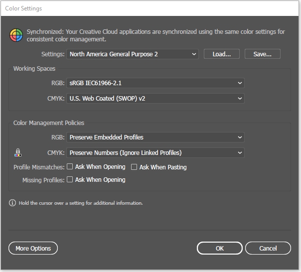
What Colour Profile Does Copywell Use?
If you’re wondering what colour profile you should be using when designing your artwork for your book, we recommend you select North American General Purpose 2, with CMYK set to U.S Web Coated (SWOP) v2. The screenshot below shows these setting in Adobe Illustrator’s Color Settings panel (Edit>Colour Setting)
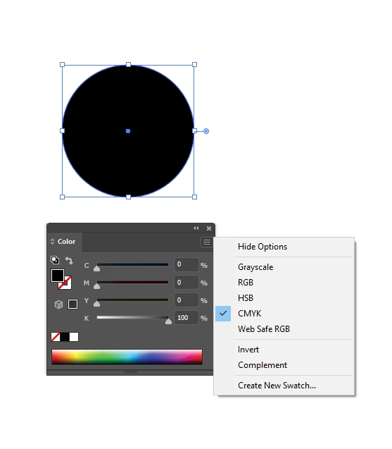
What Black Settings Should I Use?
If you’re wondering what black settings you should use for your design, we recommend you use 100% black whenever possible. This will produce a rich, deep black on our presses. The screenshot below shows what 100% Black looks like in Adobe Illustrator.