How Can We Help?
Book Interior Design & Layout
Design a Book Interior
When you are designing your book, you need to consider a number of factors. The interior pages of your book should follow best practices in book layout and design in order to provide a positive reader experience. This means keeping text a certain distance from the bound edge so it’s easy to read, and maintaining consistent margins on the top, bottom and outside so the text is positioned favorably throughout.
A common book design practice is to select a book that you have read and measure the size and margins, then copy that. All you have to do is understand what each component of a book’s design entails, then you can setup your software to produce the same thing.
Choosing a Book Trim Size
First, you should choose a trim size for your book, and then setup your software program to create your manuscript to that size. It’s very important that you set up your software correctly from the start, failure to do so can lead to lengthy reformatting before your book is ready to print.
A common mistake most first-time authors make is beginning their manuscript in Microsoft Word’s default setting, which is U.S Letter (8.5 x 11) in size, then they want to print the book at a different size. Unfortunately, this is not how to properly produce a book that is legible and follows best practice.
Your book design will be built around the trim size, so it’s very important that you choose a trim size that will yield a book that isn’t too thick and has enough room to allow a reader to hold it open and read all text easily.
What is Interior Page Margin?
Your book design will require margin settings that allow the text to be consistently positioned throughout the book. Margin is the empty space around your text, kind of like a picture frame, and should be wide enough to allow all text to be read easily when the book is printed.
A common mistake most first time authors make when they design a book is not mirroring margins, this produces inconsistent margins throughout the book and a poor reader experience because text is placed in different positions throughout the book.
Your book design should consider your reader’s needs in terms of age and accessibility, and the margin settings are an important design element that will translate to a positive reader experience. For example, a book intended for an audience under 10 years should have wide margins and large text, to help the reader see all the words clearly. A book intended for an audience over 20 years should have narrower margins and smaller text while being legible and consistent.

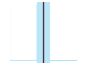
What is Gutter?
Gutter is the empty space from the text on a page to the binding edge. If your book design requires binding on the left side, then the gutter will be on the right and left side of the pages, as per the diagram below.
Your book design should use a gutter of at least 0.75″ or 1.905 cm
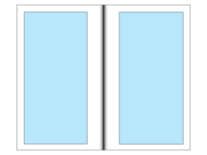
What is a Safe Text Area?
When you define your book’s margins and gutter, you have created a safe text area that will contain all your book’s content. This area is called a safe text area because all the text within this area is guaranteed to not be cut off in bindery. The diagram below shows the safe text area of a book.
What Should I Set The Gutter & Margin Settings To?
After selecting a trim size, the margin and gutter settings are very important elements of the book design. You want to ensure that you leave enough room on the top, bottom and outside sections of each page so that your reader can hold the book and not cover any text. You also want to ensure that you have left enough space for bindery in the gutter section. Below are the recommended margin and gutter settings we suggest you use in your book design.
Recommended Book Margin Settings
If you’re wondering what to set the margins at for your book, we recommend that you set margins to at least 0.375″ or 0.95 cm on the top, bottom and outside, and make sure mirror margins.
- Margin-Top: 0.375″ or 0.95 cm
- Margin-Bottom: 0.375″ or 0.95 cm
- Margin-Outside: 0.375″ or 0.95 cm
Recommended Book Gutter Settings
If you’re wondering what to set gutter at for your book, we recommend that you set gutter to 0.75″ or 1.905 cm.
- Gutter: 0.75″ or 1.905 cm
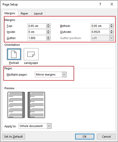
Microsoft Word Margin and Gutter Settings for Book Design
The screenshot below shows the recommended margin and gutter settings for your book design. You can access these settings by clicking Layout>Margins>Custom Margins. You need to select the orientation of your book, and apply the settings to the whole document. Then click OK and you can start your book design in Microsoft Word with a good template that will ensure your text is readable and there is enough space for bindery in any format.
What Font Size Should I Use?
The font size you choose in your book design should allow your intended audience to easily see and read all text. For example, children’s books should use a large font like 24 pt so that children can distinguish the letters from one another.
A good rule of thumb is to use at least a 12 pt font size in your book design
The size of the font also relates to the number of pages in your book (along with margin and gutter). As the font size increases, the page count does as well (if margin and gutter remain the same).
Recommended Font Sizes
If you’re wondering what to set the font size to in your book, we recommend that you set the font size to 12 pt if it’s not a children’s book. If it is a children’s book, then we recommend at least 24 pt font size.
What is a Rights Page?
Every book contains the intellectual property of the creator(s) and/or contributors, so it’s important to disclose these parties on a page within your book. When considering a book design, you should create a page that lists the publisher and all parties who own the rights to the intellectual property presented in the book. Usually, a rights page will note the printing edition as well, and acknowledge any government grants or funding assistance that contributed to the book’s production. Sometimes, it can even be a requirement that the country of printing and binding be disclosed in order to qualify for funding programs like Ontario Creates.
Do I Need a Rights Page?
If you’re wondering if you need a rights page in your book, we recommend that you have one. It’s helpful for anyone reading the book to see the source of the content and understand where it came from.
Here is a checklist of what should be displayed on a rights page:
- Publisher name
- Publishing year
- Copyright owners
- Trademark owners
- Funding partner acknowledgments
- Printing edition
- Country of print and binding
- ISBN number